
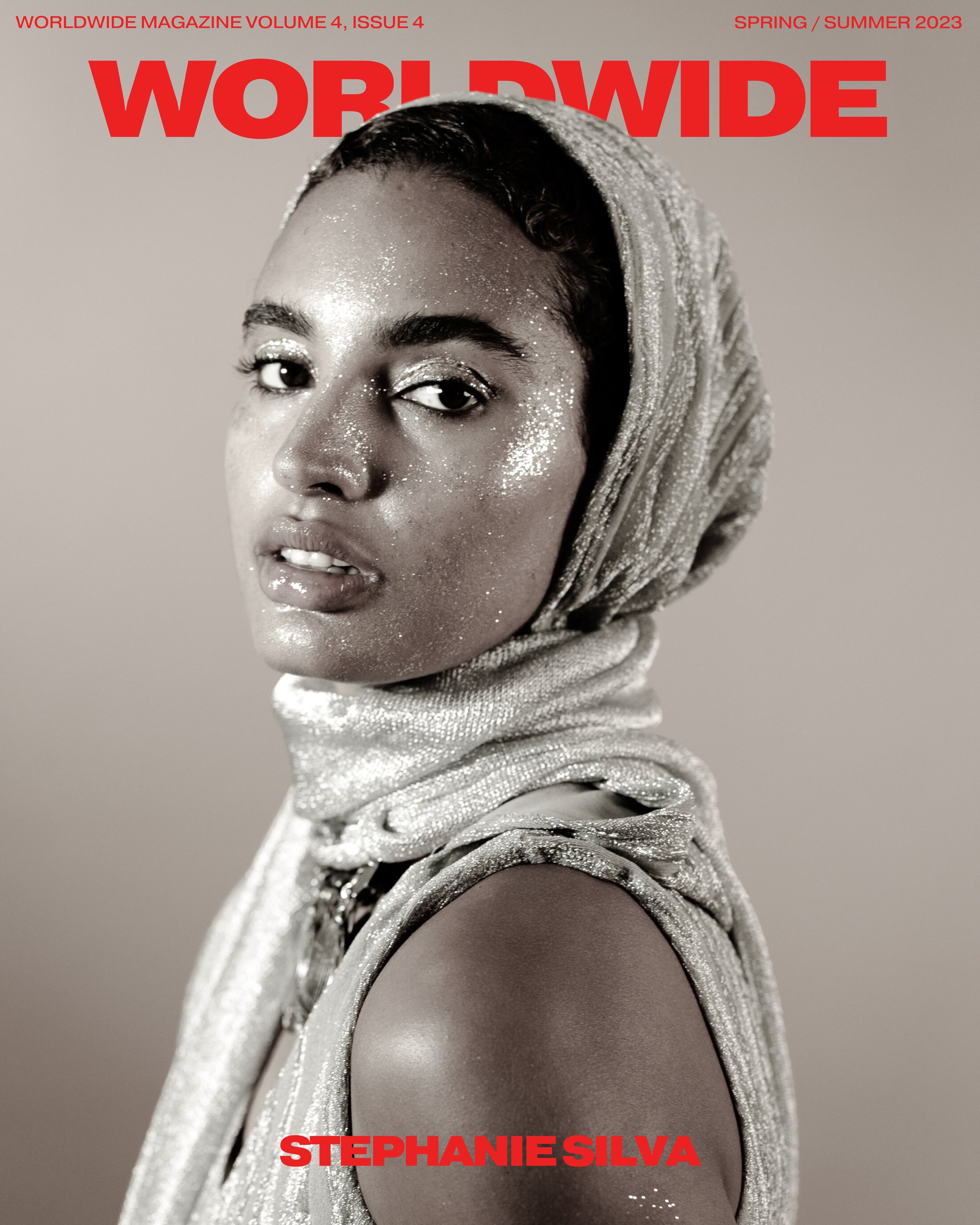
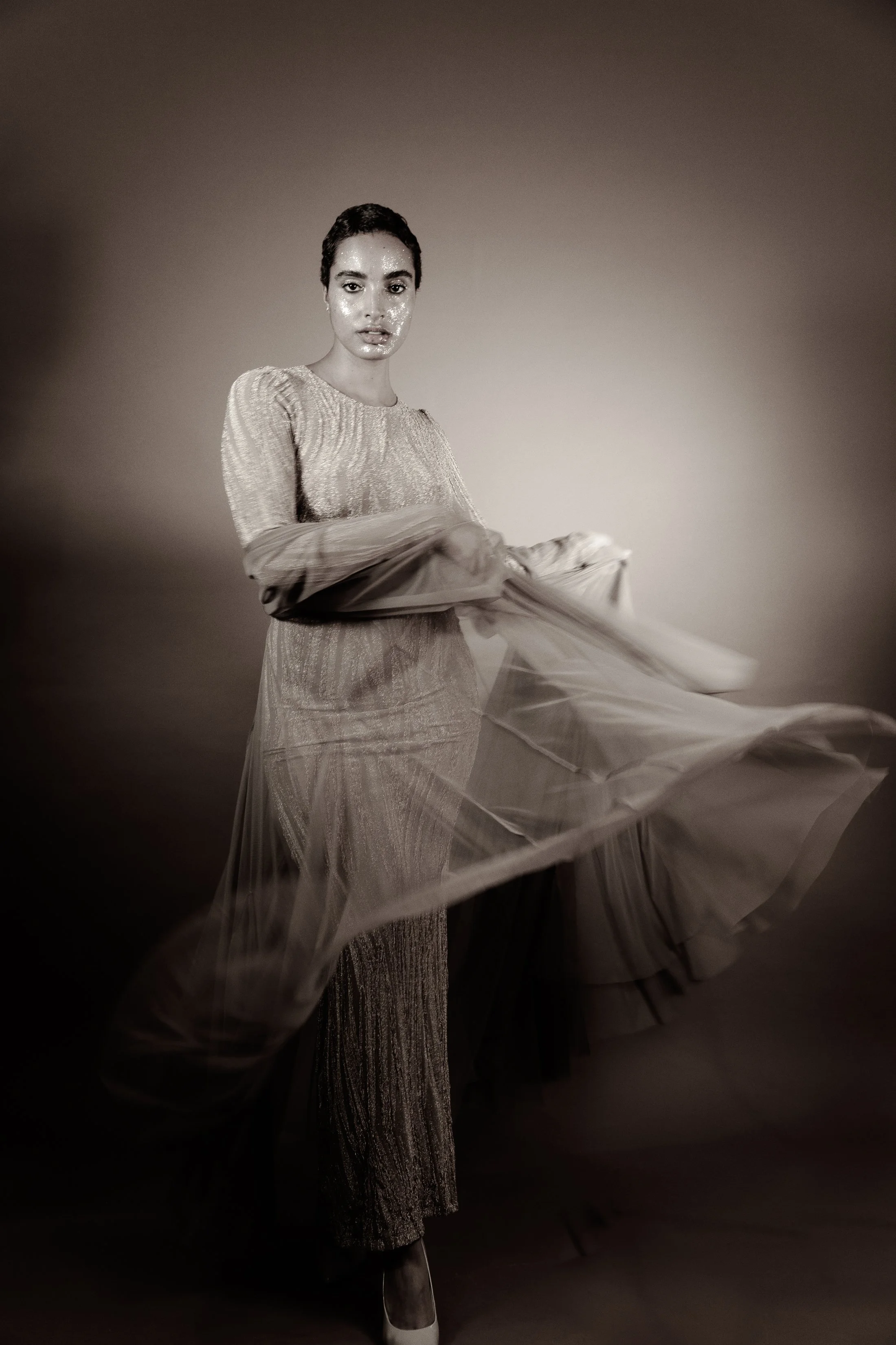
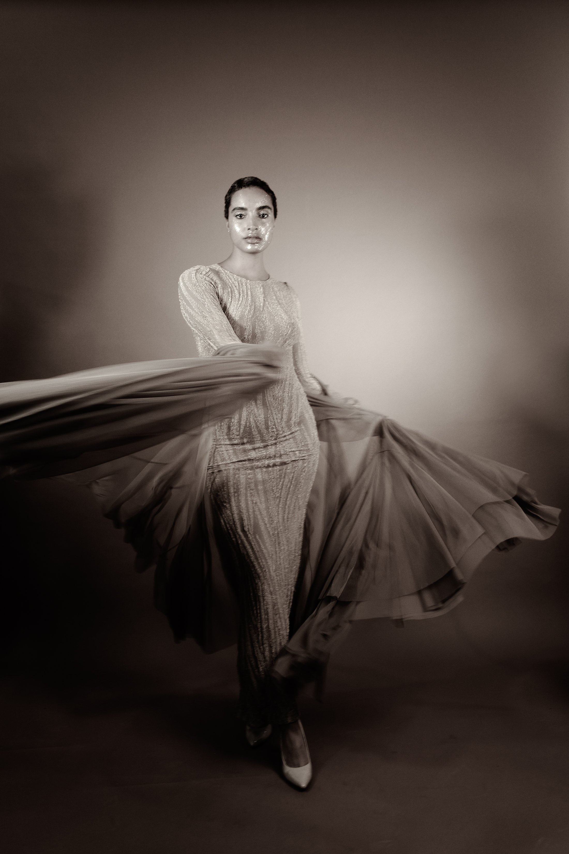
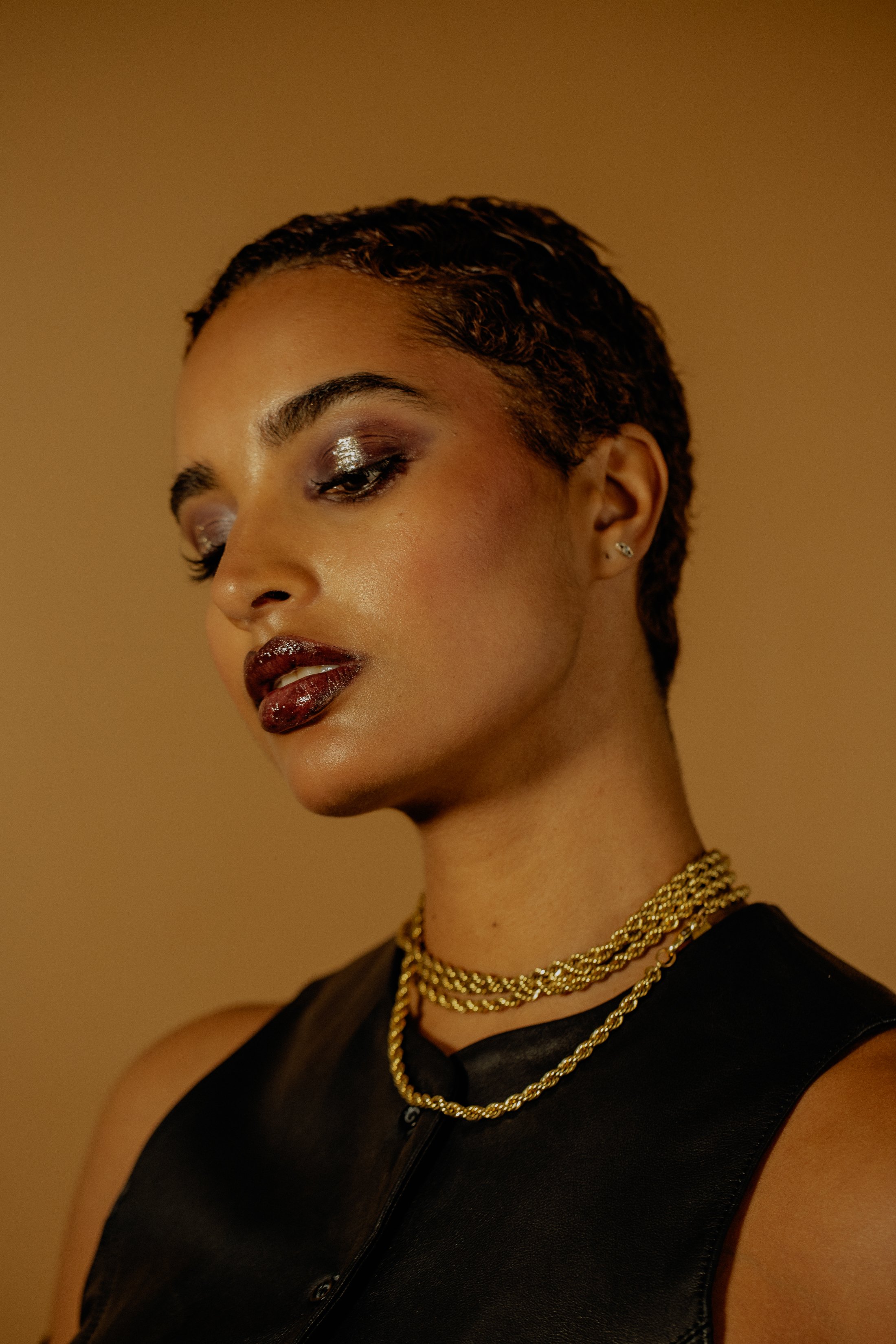
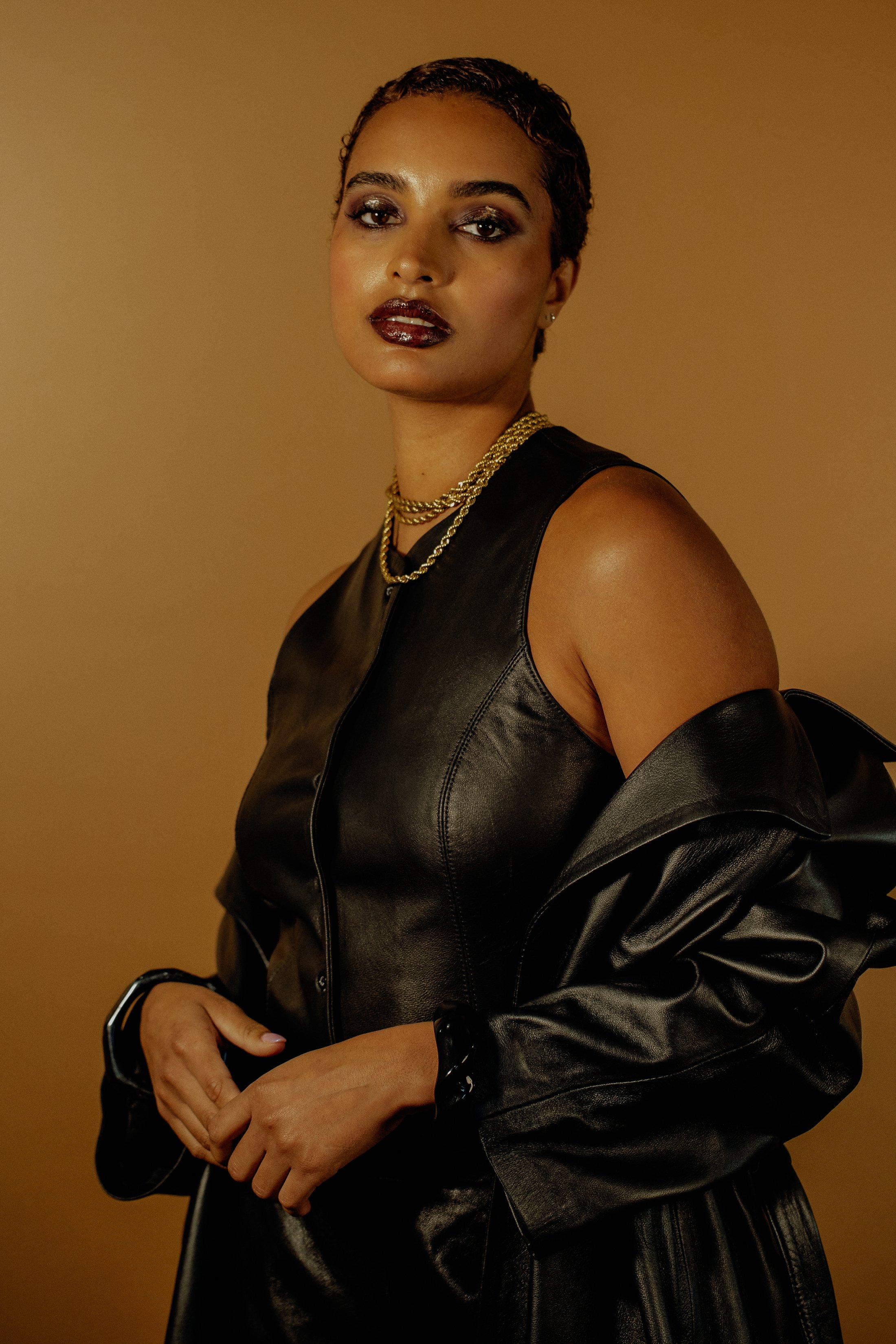
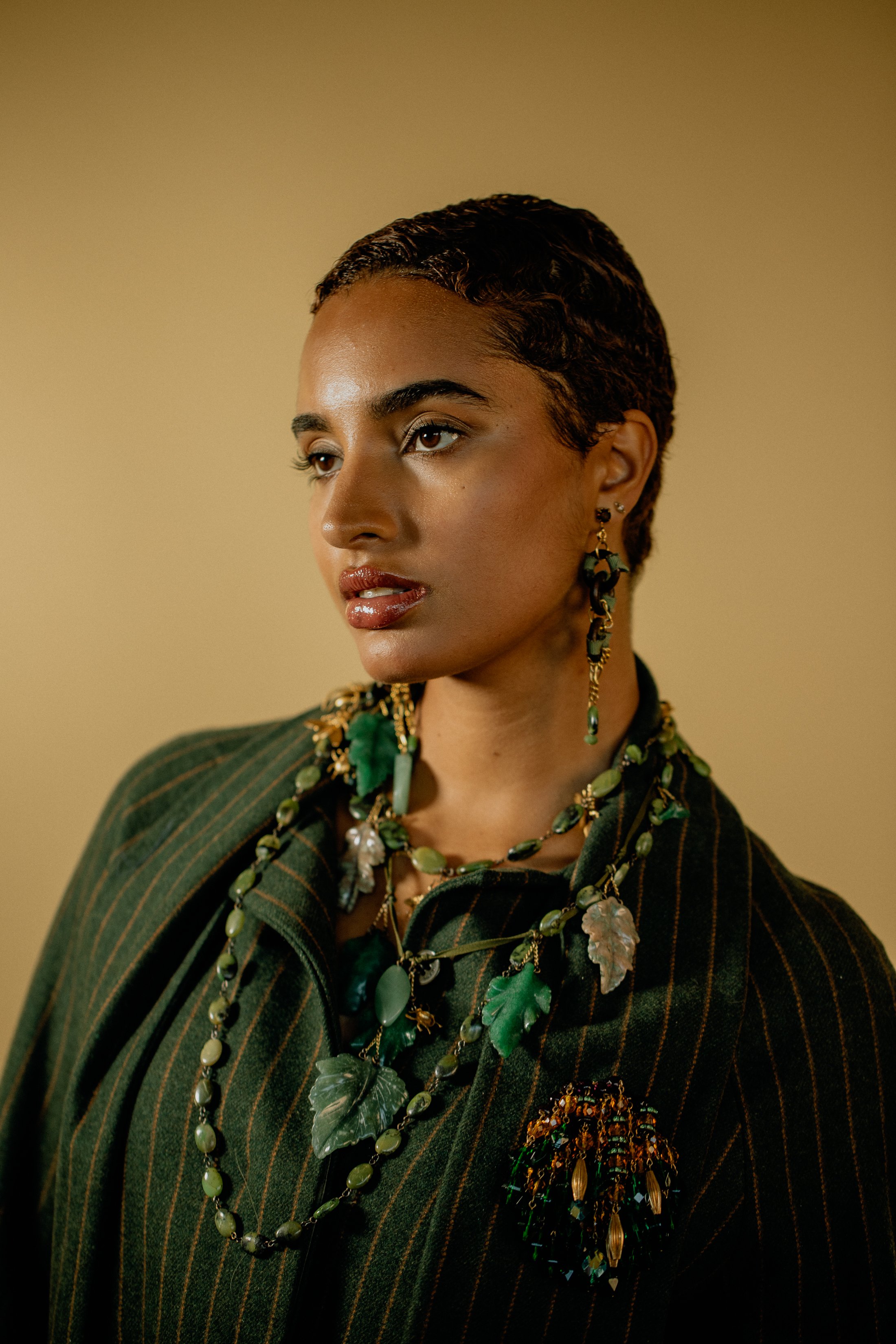
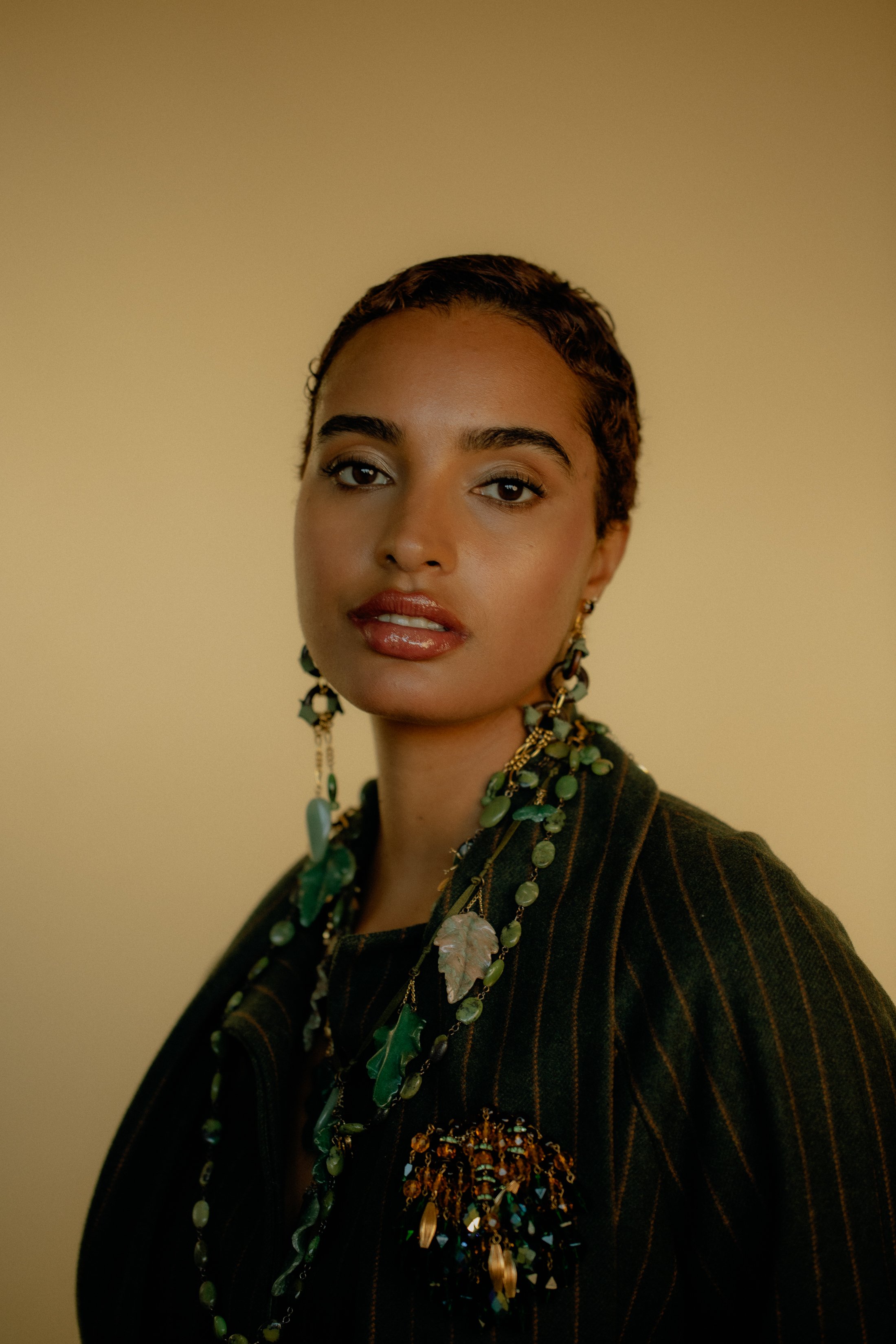
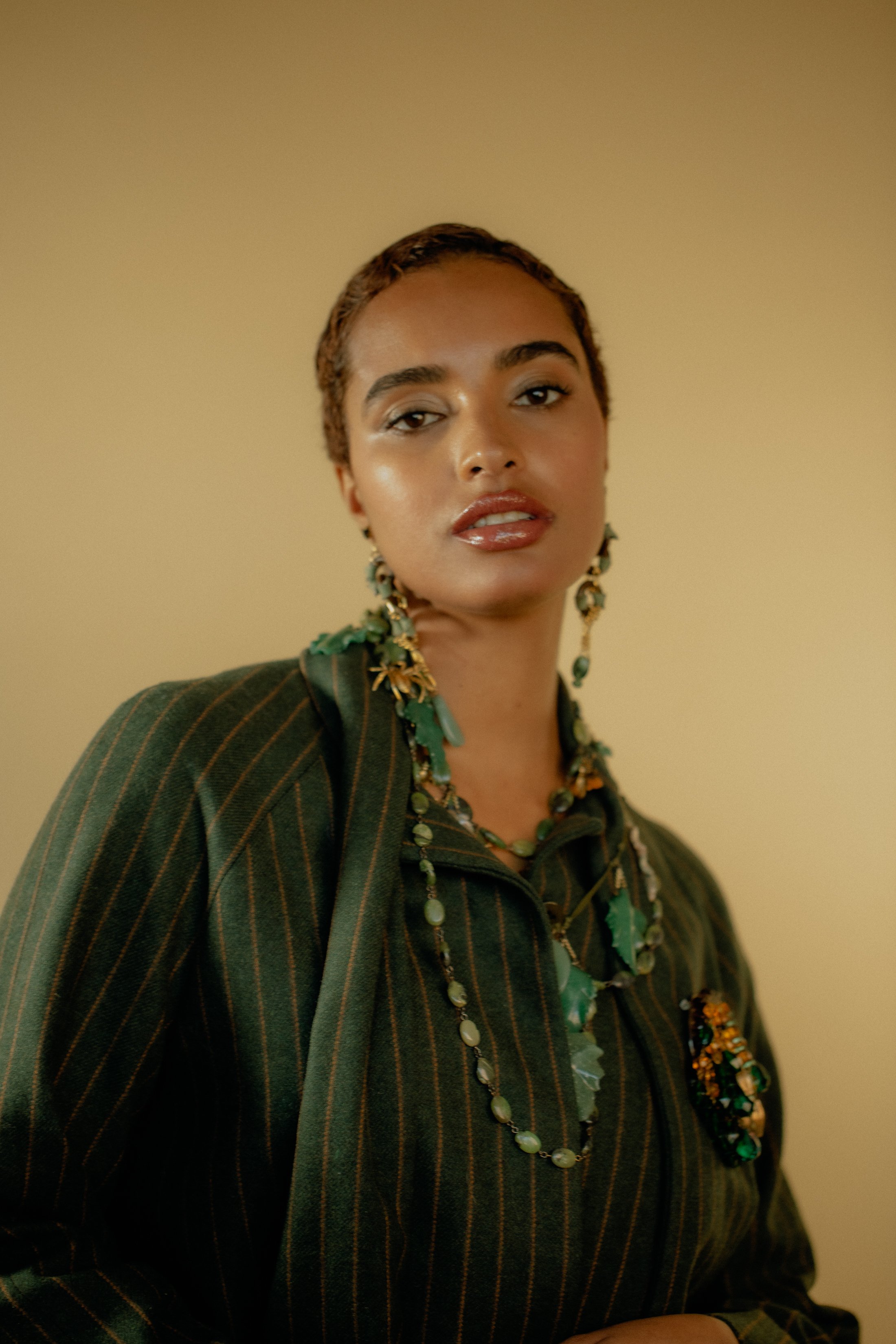
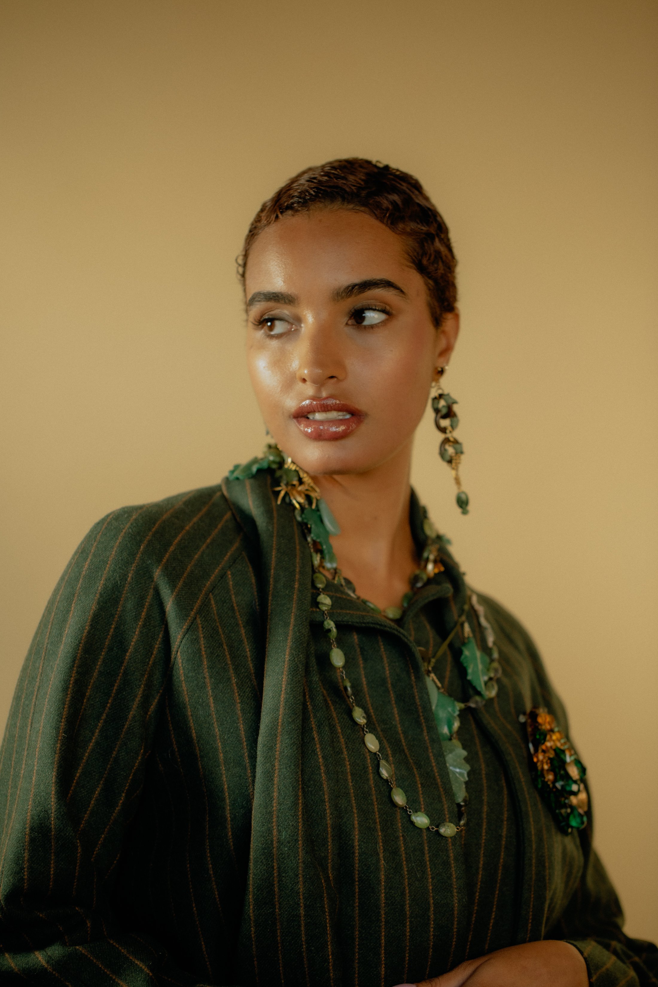
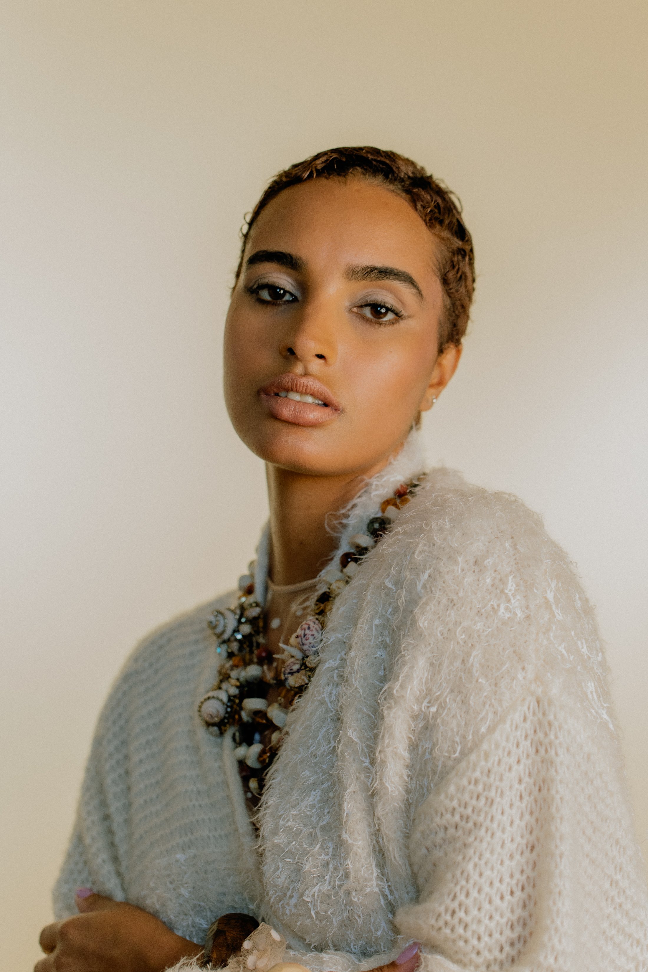
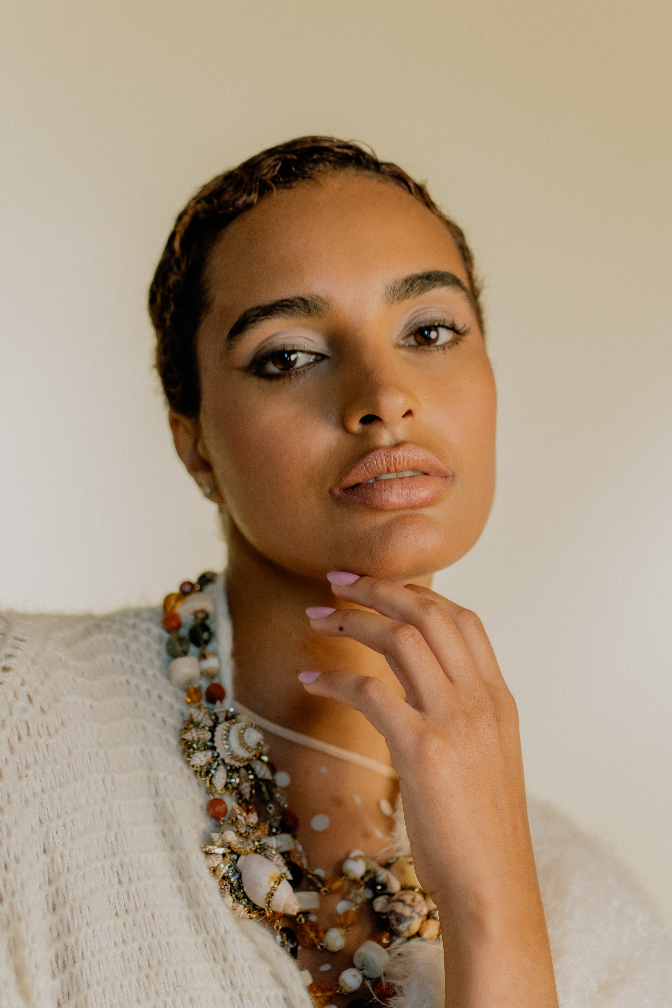
STEPHANIE SILVA X WORLDWIDE MAGAZINE
VOLUME 4, ISSUE 4. SPRING SUMMER 2023
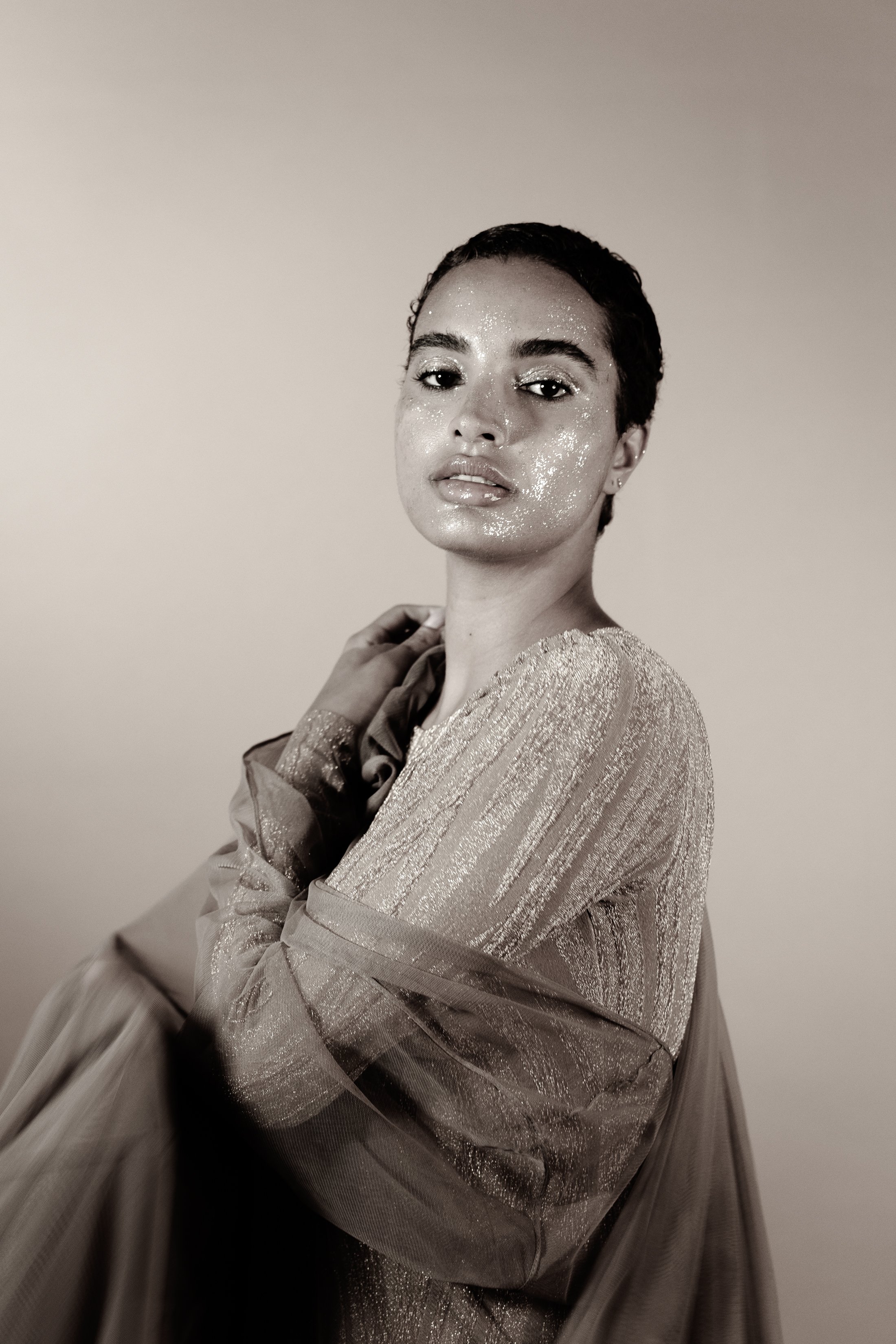
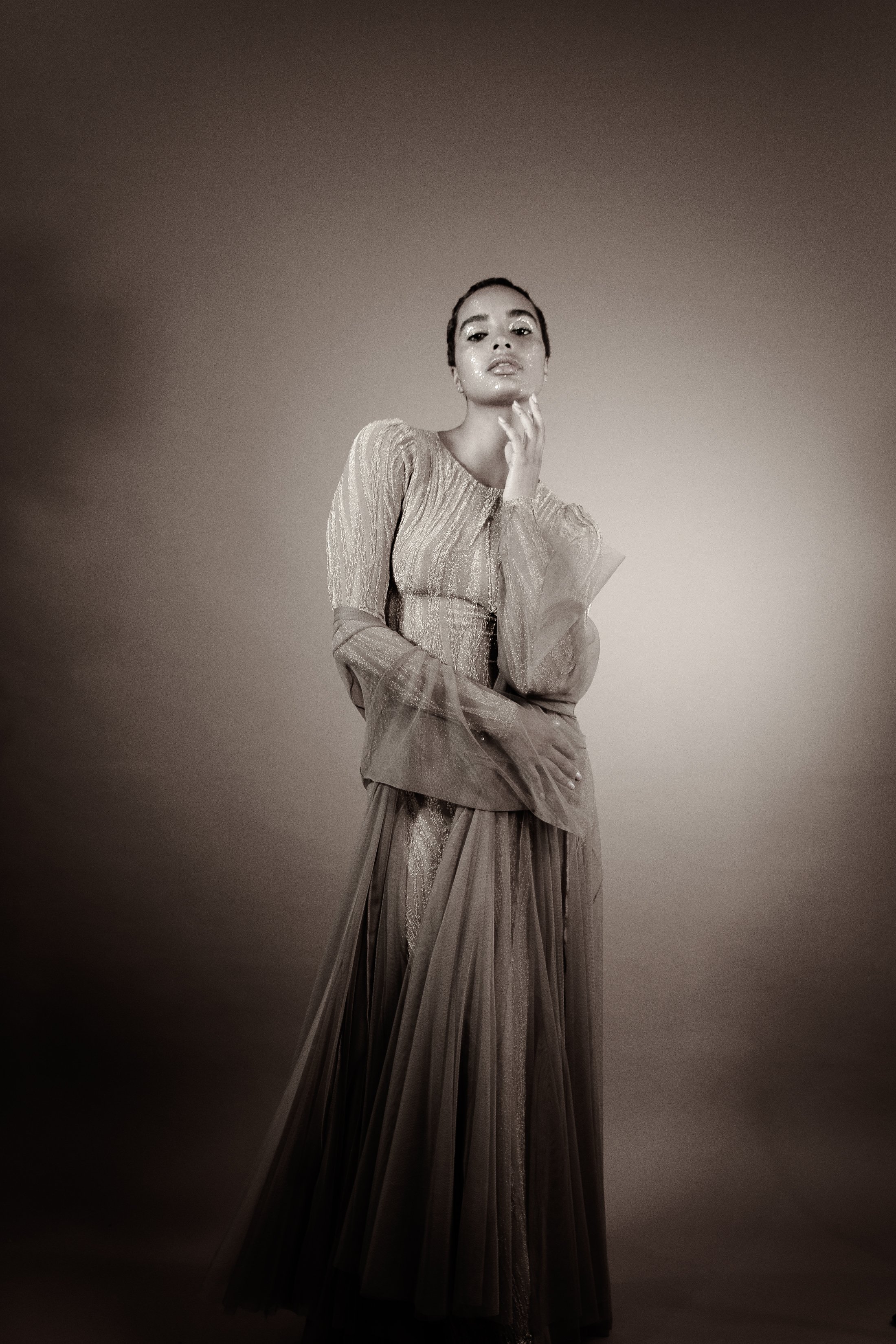
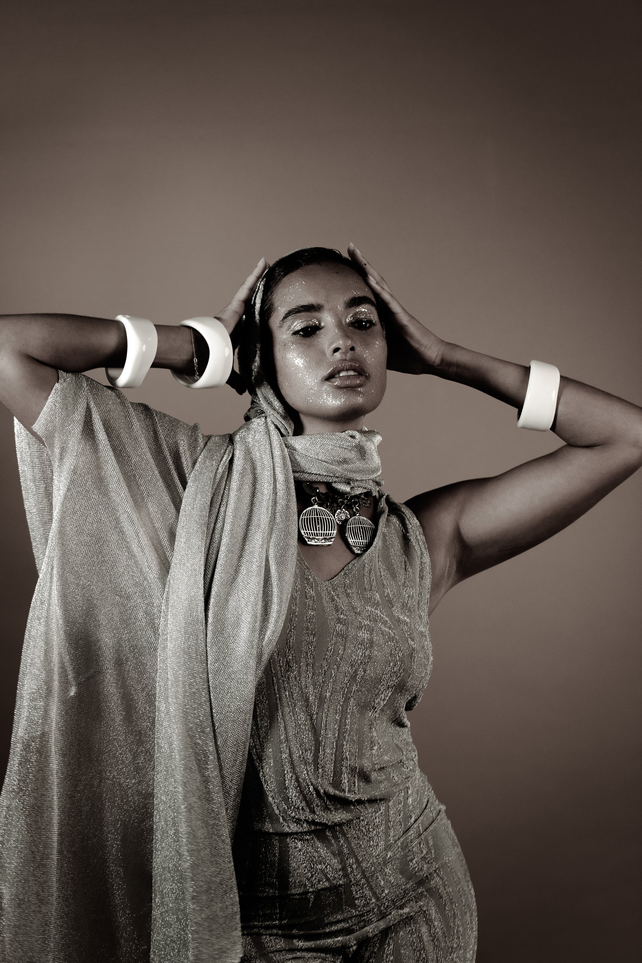
TALENT STEPHANIE SILVA ★ WARDROBE STYLIST, PRODUCER + CREATIVE DIRECTION KYRIE THOMPSON ★ STYLING ASSISTANT SHAKEERA MCCANTS ★ PHOTOGRAPHER MASSIEL VENTURA ★ PHOTO ASSISTANTS LISSETTE VENTURA + E. FRANCOISE LINO ★ MAKEUP ARTIST TOMMY TAFOYA ★ ASSISTANT MAKEUP ARTIST LINDSAY VALENTE ★ PRODUCER PJ SPLASH ★ CREATIVE DIRECTION ISAAC TAYLOR SHANE ★ VIDEOGRAPHER KHIDHAR RICH ★ SHOT AT STUDIO KIN
SPECIAL THANKS TO @showroomseven @mauibylolita @molawalker@ericksonbeamon @ninewest @pierantoniogaspari@rosak_official @la.rando.buenosaires @shopraven@moschino @stevemadden


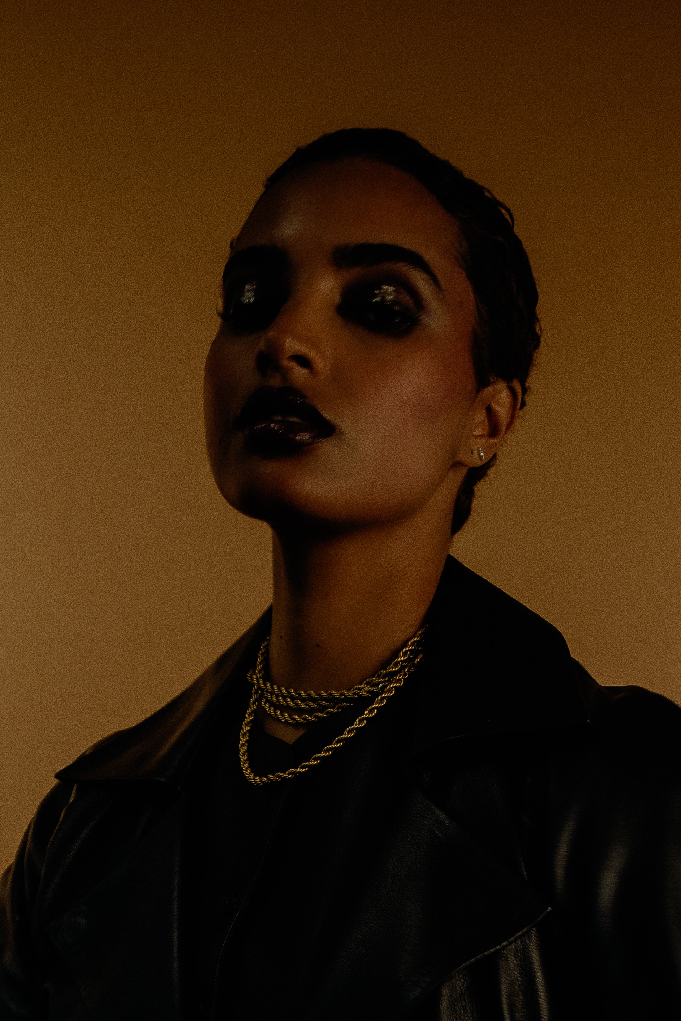
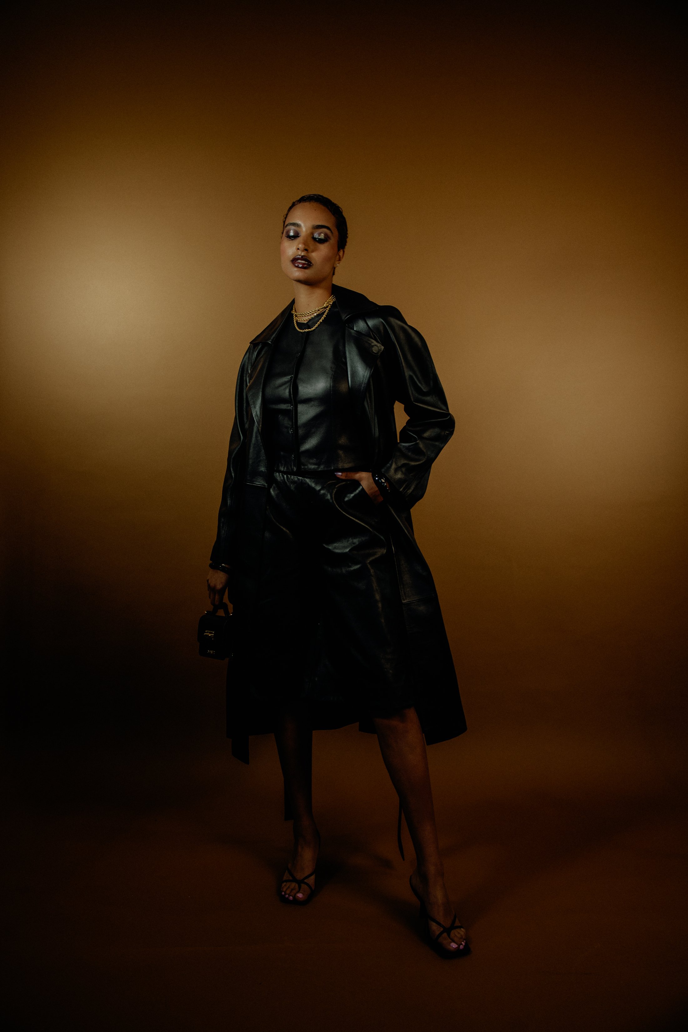

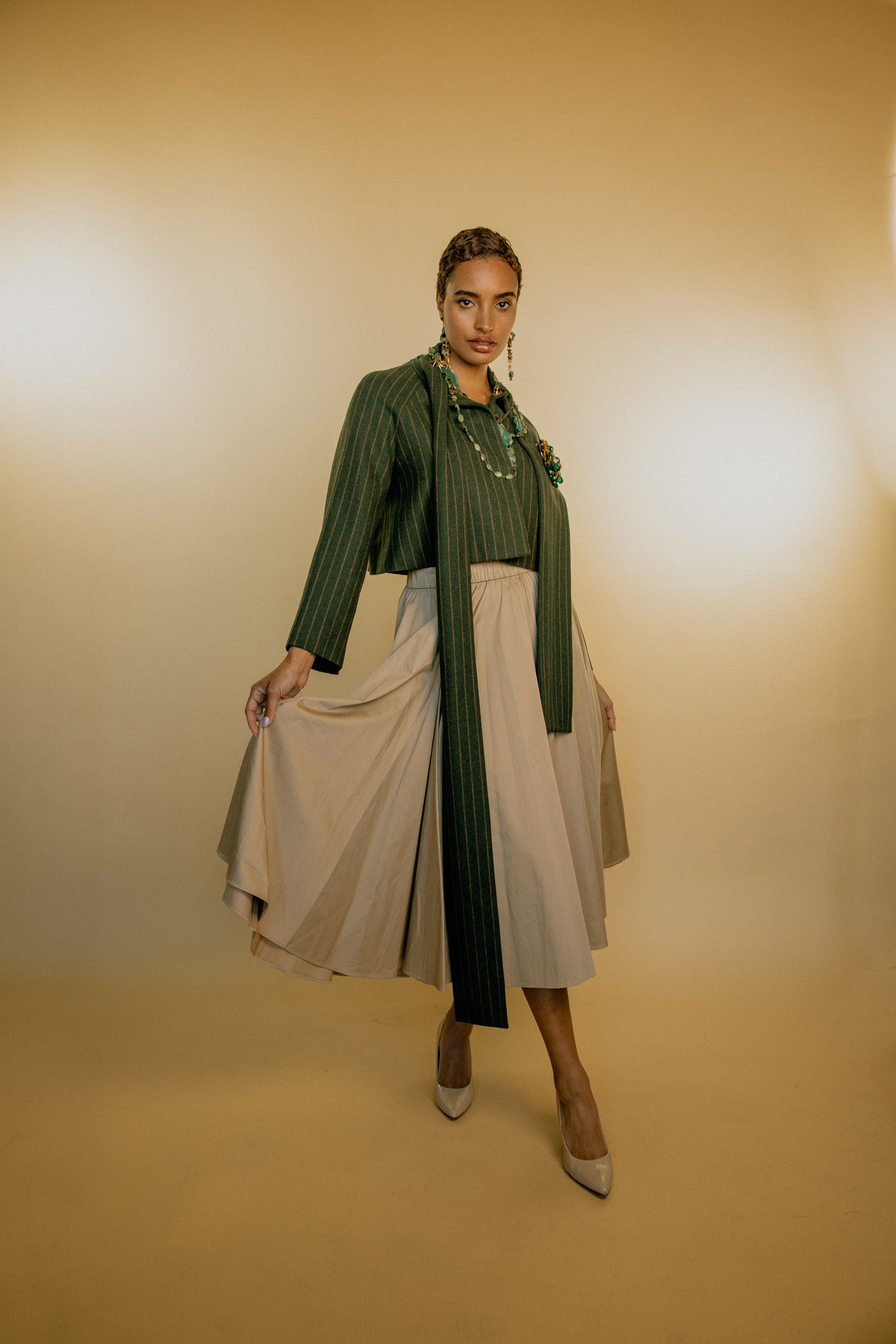
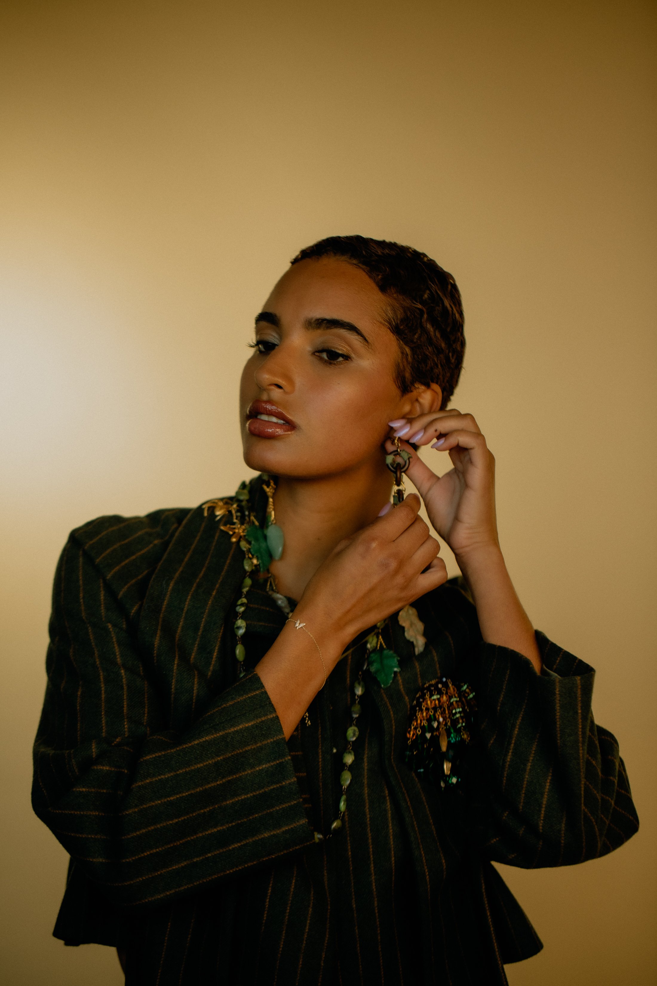



/* =========================================================
A WORLDWIDE ARCHIVE — NASTY-INSPIRED EDITORIAL BLOG GRID
Paste into: Design → Custom CSS
========================================================= */
/* ---------- Global archive mood ---------- */
body,
#siteWrapper,
#page,
.page-section,
.collection-type-blog,
.blog-list,
.blog-basic-grid {
background: #000 !important;
color: #fff !important;
}
/* Reduce default Squarespace padding so the archive feels more like a magazine index */
.collection-type-blog #page,
.collection-type-blog .page-section,
.collection-type-blog .content-wrapper,
.collection-type-blog .sqs-layout {
max-width: none !important;
}
.collection-type-blog .content-wrapper {
padding-left: 2vw !important;
padding-right: 2vw !important;
}
/* ---------- Blog grid layout ---------- */
/* Works for most Squarespace 7.1 blog archive/list layouts */
.blog-list,
.blog-basic-grid {
display: grid !important;
grid-template-columns: repeat(3, minmax(0, 1fr)) !important;
column-gap: 18px !important;
row-gap: 70px !important;
align-items: start !important;
width: 100% !important;
}
/* Each blog post card */
.blog-item,
.blog-list-item,
.blog-basic-grid--container {
position: relative !important;
margin: 0 !important;
padding: 0 !important;
background: transparent !important;
border: none !important;
}
/* ---------- Images ---------- */
.blog-item .image-wrapper,
.blog-list-item .image-wrapper,
.blog-basic-grid--container .image-wrapper,
.blog-item .blog-image,
.blog-list-item .blog-image,
.blog-basic-grid--container .blog-image {
overflow: hidden !important;
background: #111 !important;
}
/* Make thumbnails taller and more editorial */
.blog-item img,
.blog-list-item img,
.blog-basic-grid--container img,
.blog-image img,
.image-wrapper img {
width: 100% !important;
height: 52vw !important;
max-height: 620px !important;
min-height: 420px !important;
object-fit: cover !important;
display: block !important;
filter: grayscale(8%) contrast(1.08) brightness(.92) !important;
transition: transform .7s ease, filter .7s ease, opacity .7s ease !important;
}
/* Hover movement */
.blog-item:hover img,
.blog-list-item:hover img,
.blog-basic-grid--container:hover img {
transform: scale(1.035) !important;
filter: grayscale(0%) contrast(1.16) brightness(1) !important;
}
/* ---------- Text block ---------- */
.blog-item .blog-text,
.blog-list-item .blog-text,
.blog-basic-grid--text,
.blog-meta-wrapper,
.blog-meta-section {
color: #fff !important;
}
/* Keep text tight to image */
.blog-item .blog-text,
.blog-list-item .blog-text,
.blog-basic-grid--text {
padding-top: 12px !important;
max-width: 100% !important;
}
/* ---------- Metadata: categories, date, author ---------- */
.blog-meta,
.blog-categories,
.blog-author,
.blog-date,
.blog-meta-wrapper,
.blog-meta-section,
.blog-item .blog-meta a,
.blog-list-item .blog-meta a,
.blog-basic-grid .blog-categories a {
color: rgba(255,255,255,.72) !important;
font-family: Helvetica, Arial, sans-serif !important;
font-size: 10px !important;
line-height: 1.2 !important;
letter-spacing: .08em !important;
text-transform: uppercase !important;
font-weight: 400 !important;
}
/* Category links should feel like editorial labels */
.blog-categories a,
.blog-meta a {
color: rgba(255,255,255,.72) !important;
text-decoration: none !important;
border-bottom: 1px solid rgba(255,255,255,.25) !important;
}
.blog-categories a:hover,
.blog-meta a:hover {
color: #fff !important;
border-bottom-color: #fff !important;
}
/* ---------- Titles ---------- */
.blog-title,
.blog-title a,
.blog-item-title,
.blog-list-item-title,
.blog-basic-grid .blog-title a,
.entry-title,
.entry-title a {
color: #fff !important;
font-family: Helvetica, Arial, sans-serif !important;
font-size: clamp(22px, 2.3vw, 44px) !important;
line-height: .92 !important;
letter-spacing: -.055em !important;
text-transform: none !important;
font-weight: 500 !important;
text-decoration: none !important;
margin-top: 8px !important;
margin-bottom: 8px !important;
}
/* Give titles a sharper hover */
.blog-title a:hover,
.blog-item-title a:hover,
.blog-list-item-title a:hover,
.entry-title a:hover {
opacity: .6 !important;
}
/* ---------- Excerpts ---------- */
.blog-excerpt,
.blog-excerpt p,
.blog-item .excerpt,
.blog-list-item .excerpt {
color: rgba(255,255,255,.76) !important;
font-family: Helvetica, Arial, sans-serif !important;
font-size: clamp(13px, .95vw, 16px) !important;
line-height: 1.28 !important;
letter-spacing: -.015em !important;
margin-top: 8px !important;
margin-bottom: 0 !important;
}
/* Limit excerpts so cards stay clean like an index */
.blog-excerpt {
display: -webkit-box !important;
-webkit-line-clamp: 4 !important;
-webkit-box-orient: vertical !important;
overflow: hidden !important;
}
/* ---------- Read More link ---------- */
.blog-more-link,
.blog-more-link a,
.read-more,
.read-more a,
.blog-item .sqs-block-button-element {
color: #fff !important;
background: transparent !important;
border: none !important;
padding: 0 !important;
margin-top: 14px !important;
font-family: Helvetica, Arial, sans-serif !important;
font-size: 10px !important;
line-height: 1 !important;
letter-spacing: .12em !important;
text-transform: uppercase !important;
text-decoration: none !important;
}
.blog-more-link a::after,
.read-more a::after {
content: " +" !important;
}
.blog-more-link a:hover,
.read-more a:hover {
opacity: .55 !important;
}
/* ---------- Create irregular editorial rhythm ---------- */
/* Every 1st item becomes a larger lead story */
.blog-list > *:nth-child(1),
.blog-basic-grid > *:nth-child(1) {
grid-column: span 2 !important;
}
.blog-list > *:nth-child(1) img,
.blog-basic-grid > *:nth-child(1) img {
height: 64vw !important;
max-height: 780px !important;
}
/* Every 7th item becomes wide, creating a magazine rhythm */
.blog-list > *:nth-child(7n),
.blog-basic-grid > *:nth-child(7n) {
grid-column: span 2 !important;
}
.blog-list > *:nth-child(7n) img,
.blog-basic-grid > *:nth-child(7n) img {
height: 58vw !important;
max-height: 700px !important;
}
/* ---------- Header/navigation harmony ---------- */
.header,
.site-header,
.header-announcement-bar-wrapper {
background: #000 !important;
color: #fff !important;
}
.header a,
.site-header a,
.header-nav a,
.header-menu-nav a {
color: #fff !important;
font-family: Helvetica, Arial, sans-serif !important;
font-size: 11px !important;
letter-spacing: .08em !important;
text-transform: uppercase !important;
}
/* Optional: make the active page feel like a selected magazine tab */
.header-nav-item--active a,
.header-menu-nav-item--active a {
border-bottom: 1px solid #fff !important;
}
/* ---------- Page title / archive title ---------- */
.collection-title,
.blog-list-title,
.page-title,
h1 {
color: #fff !important;
font-family: Helvetica, Arial, sans-serif !important;
font-size: clamp(42px, 8vw, 130px) !important;
line-height: .82 !important;
letter-spacing: -.075em !important;
text-transform: uppercase !important;
font-weight: 500 !important;
margin-bottom: 40px !important;
}
/* ---------- Pagination / load more ---------- */
.blog-list-pagination,
.pagination,
.item-pagination,
.blog-list .pagination {
color: #fff !important;
border-top: 1px solid rgba(255,255,255,.18) !important;
margin-top: 80px !important;
padding-top: 24px !important;
}
.pagination a,
.blog-list-pagination a,
.item-pagination a {
color: #fff !important;
font-family: Helvetica, Arial, sans-serif !important;
font-size: 11px !important;
letter-spacing: .12em !important;
text-transform: uppercase !important;
text-decoration: none !important;
}
/* ---------- Mobile ---------- */
@media screen and (max-width: 1024px) {
.blog-list,
.blog-basic-grid {
grid-template-columns: repeat(2, minmax(0, 1fr)) !important;
column-gap: 14px !important;
row-gap: 52px !important;
}
.blog-list > *:nth-child(1),
.blog-basic-grid > *:nth-child(1),
.blog-list > *:nth-child(7n),
.blog-basic-grid > *:nth-child(7n) {
grid-column: span 2 !important;
}
.blog-item img,
.blog-list-item img,
.blog-basic-grid--container img,
.blog-image img,
.image-wrapper img {
height: 70vw !important;
min-height: 340px !important;
}
}
@media screen and (max-width: 640px) {
.collection-type-blog .content-wrapper {
padding-left: 14px !important;
padding-right: 14px !important;
}
.blog-list,
.blog-basic-grid {
grid-template-columns: 1fr !important;
row-gap: 48px !important;
}
.blog-list > *,
.blog-basic-grid > * {
grid-column: span 1 !important;
}
.blog-item img,
.blog-list-item img,
.blog-basic-grid--container img,
.blog-image img,
.image-wrapper img {
height: 118vw !important;
min-height: 420px !important;
}
.blog-title,
.blog-title a,
.blog-item-title,
.blog-list-item-title,
.entry-title,
.entry-title a {
font-size: 30px !important;
line-height: .9 !important;
}
.blog-excerpt {
-webkit-line-clamp: 3 !important;
}
}